Buttons play a crucial role in user interaction, and Flutter’s Container and ElevatedButton combo is a powerhouse for creating eye-catching buttons
Using Button Widget
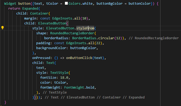
1. Flexible Design with Expanded:
The button’s flexibility is showcased through the Expanded widget, allowing it to adapt and fill available space.
2. Using Container :
The outer Container serves a dual purpose – it provides a margin, enhancing visual separation, and introduces a touch of style to the button.
3. ElevatedButton Configuration:
- Shape Customization: The button with rounded corners, achieved through the
RoundedRectangleBorderand a border radius of 12. - Padding Definition: A padding of 22 units ensures a comfortable touch area for better user experience.
- Background Color Dynamism: The button’s background color is dynamic as it will take values from the parameters.
4. Text Styling for Clarity:
Font size, color, and bold font weight are all customizable, ensuring readability.
5. Interaction Handling for Functionality:
The button comes to life with the onPressed() callback, connecting it to the broader functionality of your application. It’s not just a static element but an interactive part of the user experience.
So, this short code example gives you a guide on making buttons that fit smoothly into your app’s look and feel. You can try out different colors, adjust sizes, and use the button widget for different situations to see how flexible it can be.